We’ve all been there. You have a cart loaded with products from your favorite online store.
You’re about to check out when there’s an error with your address. You go back and enter your address again. Error...
Frustrated, you abandon your cart and move on to something else. The website you’ve left behind? They’ve lost a sale.
How can you avoid these kinds of scenarios from affecting your site? It may not be as easy as introducing new sales software into your business, but it’s close.
Read on for 7 pieces of advice that will improve the customer experience of your business’s checkout process.
1. Limit Distractions
Remove page distractions
Once your customer has reached the checkout stage of their shopping experience, remove distracting content that will draw their attention away from completing their purchase.
Let’s say you’re selling communication software. Your customer is there, with a product in their cart. They don’t need to be bombarded by sidebars filled with blogs on team collaboration meaning, or popups offering ebooks about the marketing industry. You’ve already got their attention.
By the time a customer is on the checkout page, they’ve made their decision.
Distractions to avoid include:
- Social media links
- Busy headers and footers
- Links to other pages
- Popups about email newsletters
Keep it simple and keep the customer-focused. There’s time for these extra bits before or after the process, but not during.
Remove unnecessary fields
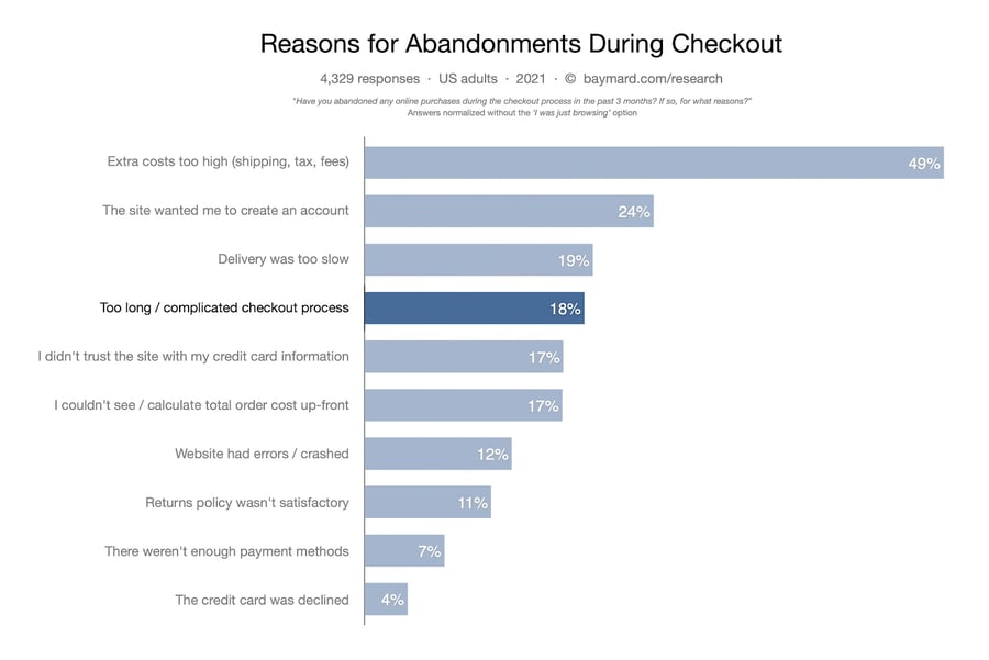
Another way to keep it simple is to limit the number of fields the customer has to complete to checkout. A study done by Baymard Institute found that the average checkout contains nearly 15 form fields, and 18% of users have abandoned orders because the checkout process was too long.
So how can you keep those customers around? Here are some ideas to try:
- Limit your fields to the essentials. If you don’t serve a lot of businesses, remove the company name field.
- Limit the telephone number fields - and don’t make a landline a requirement.
- Remove “Address Line 2”; keep it simple with one address field for the customer to fill out.
- Have an automatic address fill-in, meaning customers only need to add their postcode and choose from a generated list.
One page to rule them all
Consider hosting the checkout page on one single page that encompasses everything. This provides the customer with ease and convenience. If this approach doesn’t suit your business, make sure the checkout steps are easy for the customer to navigate.
2. Cart Management
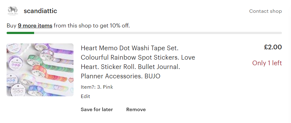
There are few things less frustrating than looking at your curated shopping cart, realizing you’ve added two of something, and now are unable to find the “Edit Cart” button.
So, make it easy to adjust your cart without having to leave the checkout page. Also, make sure customers can see the number of items in their cart as they browse your site.
Another option to help your customers manage their cart is to provide a “Save for Later” option. This way anyone browsing, but not ready to buy can easily find their saved items at a later date.
3. Keep It Simple
Guest checkout
According to the Baymard Institute study cited earlier, 24% of customers abandoned their cart because the site wanted them to create an account. The solution? Give your customer the option to checkout as a guest or signup to your site.
Error validation
As mentioned earlier, trying to figure out an error in an address field can quickly drive a customer from your site. Make sure form fields are clearly labeled and self-explanatory. At the same time, make sure any errors are easy to find and correct.
Another solution to error validation? Auto-detection. Like automated customer support, autodetection can make the customer’s life easier. Try implementing auto-detection of location based on the customer’s IP address.
This can speed up address and currency information. Auto-detection of address and address look-up can also eliminate any customer error. Fewer errors mean fewer shipping delays, thus saving you money.
4. Payment Options
Have you ever gone to a store and found yourself at the checkout, panicked, staring at a sign on the register that says, “CASH ONLY”?
We’ve all been there. Don’t be that eCommerce site. Offer your customers a variety of ways to pay.
Don’t be afraid to try some new methods of payment. Back in the day, you may have employed one person to answer all incoming phone inquiries, but after answering the question: What is interactive voice response (IVR)? You’ve probably completely changed your businesses’ customer service.
Similarly, sites have offered customers the ability to pay with more traditional methods, like debit cards, credit cards, and third-party sites, like PayPal.
If it makes sense for your business, consider adding the use of digital wallets, such as Apple Pay and Google Pay, to your site.
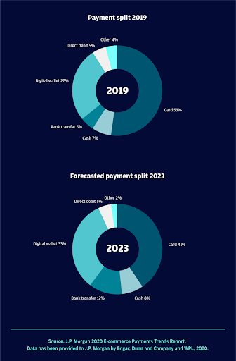
Digital wallets are growing at a compound annual growth rate of 23%. By 2023, they will account for almost a third of payments. Don’t lose business now when digital wallet use continues to grow.
Remember layaway? These days, customers can use buy now, pay later services, like Klarna, Affirm, and Afterpay to stretch out the cost of purchases.
In a 2020 study, 22% of customers said flexible payment options were an encouraging factor in their purchase decisions - so make sure to offer it to your customers.
5. Show the Customer They Can Trust Your Site
Have you ever gotten to the last stage of checkout on a website and felt like something was off? Providing your customers with a sense of security and trustworthiness is essential to optimizing your website’s checkout process.
17% of customers abandon their cart if they perceive the website they’re on to be untrustworthy.
When designing the checkout process’s payment section, consider highlighting the credit card payment section so it looks official and secure. Ward off customer fears by displaying the following:
- SSL seals, which indicate security on a technical level. Examples include Norton, Trustwave, and Comodo SSL.
- Trust seals, which indicate a trusted business verification. For example, BBB Accredited and TRUSTe.
It doesn’t hurt to display membership to any trusted organizations and highlight return policies and privacy policies, which customers will appreciate.
These small steps will ensure that you won’t lose any critical business to a lack of trust. What is customer satisfaction, if not that?
6. Game Changers
Sometimes you can do everything right and still lose a customer at checkout. Short of a new sales enablement approach, what else can you do to get your customer over the finish line and make them a repeat customer?
Highlight the product and customer reviews
If a customer feels unsure about pulling the trigger on a new espresso machine, seeing highly rated product reviews on-screen that confirm their confidence in the product may help. Additionally, videos can improve the customer experience by highlighting different features of the product and boosting its appeal and ease of use.
Only five left!
Emphasizing the stock levels of specific goods and services may convince some customers to complete their purchase in a timelier manner than they would otherwise. Depending on your business, stock level notifications may help your conversion rate.

Up-selling, cross-selling, and order bumps
Another way to optimize the checkout process is to highlight products that complement or enhance what’s already in the customer’s cart. Is your customer buying an expensive tablet?
Highlight the additional warranty package at checkout, a classic order bump. Or go for the up-sell and showcase the next model up. A cross-sell might be a cover for the tablet or a scratch-proof screen cover.
Keep it simple by highlighting top-rated items similar to what the customer has already eye-balled, thus creating a hyper-personalized customer experience. Just remember: this should be done before they start entering their details - otherwise, it’s just a distraction!
Utilize abandonment emails
Imagine you’re in the middle of reading an enticing email with the headline, Free Online Meeting Tools: Join or Host Meetings From Anywhere…when suddenly another email catches your eye, You’ve Left Something Behind!
In a study done by Moosend, 45% of cart abandonment emails are opened by customers, and 21% of those opened emails received click-throughs. Abandonment emails can reengage your customer and help gain revenue you might have otherwise lost.
7. Optimize For Mobile
One of the most important and effective things a company can do after implementing SKU product, optimizing their inventory, and building their site is to make sure their mobile and online platforms offer a seamless user experience.
This seamless experience should apply to every inch of the company, including the checkout process.
Unfortunately, mobile has the highest cart abandonment rate of all devices, with roughly 85.65% ending without a sale.
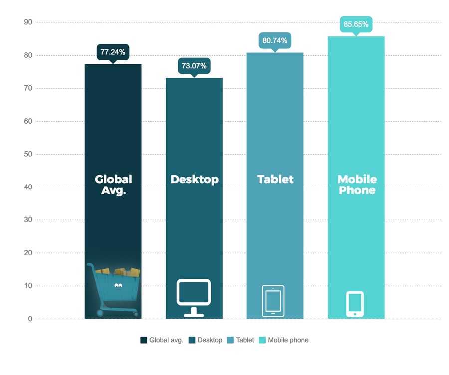
So, make sure the functionality of your mobile checkout process is straightforward.
Customers will appreciate an uncluttered approach with simple form fields, one-click checkout options, and logical call-to-action buttons.
The same checkout process optimization rules should apply to mobile, tablet, and desktop. But, as more and more shoppers turn to their mobile devices to shop, optimizing your mobile checkout is critical.
Time to Checkout
Revisit your checkout process regularly to make sure it’s serving your customers’ best interest. Stay up to date with new checkout features, especially digital wallets and Buy Now, Pay Later services.
Most importantly, remember to keep your site streamlined and secure. As Andrea Hippeau, Principal at VC fund Lerer Hippeau told Forbes, “This is a time for trust and transparency,” she said. “You will forever lose that customer if the experience isn’t top-notch.”
