We’re excited to introduce you to the new DataFeedWatch navigation and layout.
We have upgraded the navigation to make it easier to find your way around the tool and to separate the navigation from the pages that you are working on. The new navigation design has an updated look and is more responsive and intuitive.
What's new?
We have covered all changes at length down below, but if you want to take a quick glance at what is new and newsworthy look no further. Ladies and gents we give you the DataFeedWatch layout updates:
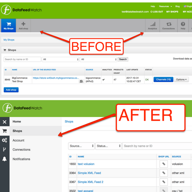
1. Navigation Bar Moved to the Left
The navigation bar has been moved to the left and some of the menu items were grouped together.
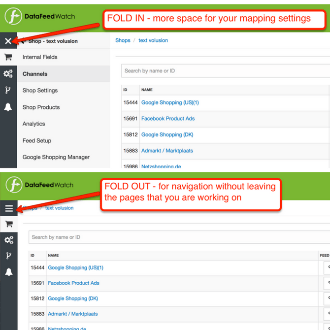
2. Fold in & Fold out navigation menu
You can fold in and fold out the navigation menu. This allows users to have more screen space when doing their mappings.
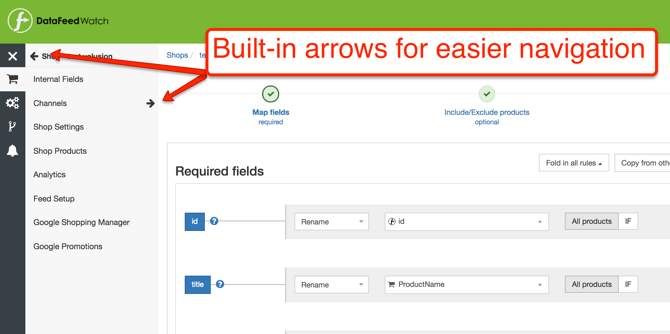
3. Back & Forward Arrows
We now have navigational arrows that allow you to navigate the menu without leaving the page you’re on.
So, now that you had a quick digest of the updates let us show you what nifty updates we’ve just introduced.
Homepage Navigation
The biggest and most noticeable change is that we have moved the navigation from the top of the screen, to the left-hand side of the page.
Before navigation items might have been scattered in the top menu, but now they’re all grouped and organized to the left in four categories:
- Shops:Internal Fields, Shop Settings, Shop Products, Analytics, Feed Setup, Google Shopping Manager, Google Promotions
- Account:Account Settings, Billing & Invoices, Plans, Sub-accounts, Notification Settings
- Connections:All your Google Adwords and Google Analytics accounts connected to DataFeedWatch
- Notifications:All feed processing errors
Before
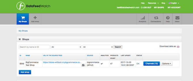
After

Most important we took the feedback from our customers and now you don’t have to leave the page anymore in order to go to a new navigation item.
Shop and Channels Navigation
This section has been completely restructured to be more intuitive. Some elements that were previously hidden in the Options menu are more prominent now: Shop Settings and Shop Products.
- Shop settings, also called Edit Shop, is where users can make edits to their feed source and change the update time of your feed.
- Shop Products, known as Show Products, is where an overview of all products in the source and output feeds is available.
Add-ons are also easier to discover in the Shop navigations menu: Feed Setup, Google Shopping Manager and Analytics.

Other changes that will come in handy are:
- The navigation arrows will allow you to go back to the previous menu without leaving the page;
- The URL, previously taking up a lot of space has been replaced by an icon. Clicking the URL icon will show you the complete output feed URL.
- Channel options button has been also replaced by a button
Before

After
![]()
Mapping Page Navigation
The mapping page hasn’t gone through a major redesign process but there are some small tweaks that are going to make the mapping process even easier.
Let’s take a look at what you can find new on this page:
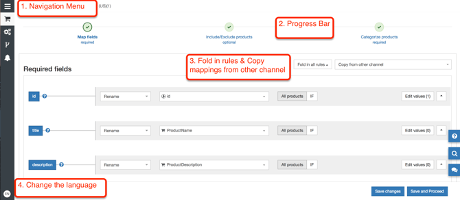
- Fold in and out the navigation menu. This will enlarge the mapping space which can be useful especially for those working on smaller monitors.
- A progress bar with the steps needed for getting your feeds in good shape for any given channel.
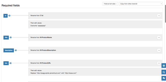
- Fold in rules and Copying rules from another channel will save you tons of time if you want to use the same mapping rules you’ve created for other channels. Of course, you can always tweak those rules to adjust them to every channel.
The fold in functionality allows you to double check the mapping at a quick glance before moving to the next step.
Account Section
This is where we’ve grouped all things pertaining to the administrative side of your account.
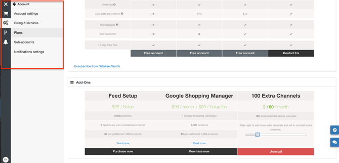
- Account Settings - you can update your DataFeedWatch credentials.
- Billing & Invoices - is where you will find all information regarding your CC/ Company details/ and Invoices.
- Plans - you can upgrade your pricing plan or enhance your account with one of the add-ons.
- Sub-accounts - you can give limited or full access to team members and clients to DataFeedWatch
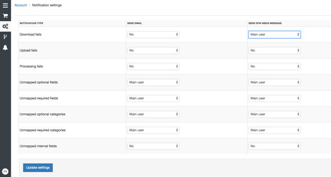
- Notification Settings - you can decide what for, where and who receives the notifications for: failed downloads or uploads and unmapped fields and categories.
As always, the best discussions happen in the comments section. If you have questions, feedback, or if you think that this new navigation is the best thing since sliced bread let us know.
Keep an eye on our blog, we’ve got some more updates on the pipeline for you!